Tuesday, December 14, 2010

Bow Project: Imaginative Drawing

This was by far my favorite to come up with, and mostly to execute until I got to the tiles on the wall. But I digress...this concept spoke to me from the very beginning, and I fought with Mrs. Parker for the chance to do it. She finally agreed to allow me to do it as long as I kept a good amount of sophistication in the drawing. The bow is not the focus of the drawing, but it professes an idea that the picture would not function correctly without.

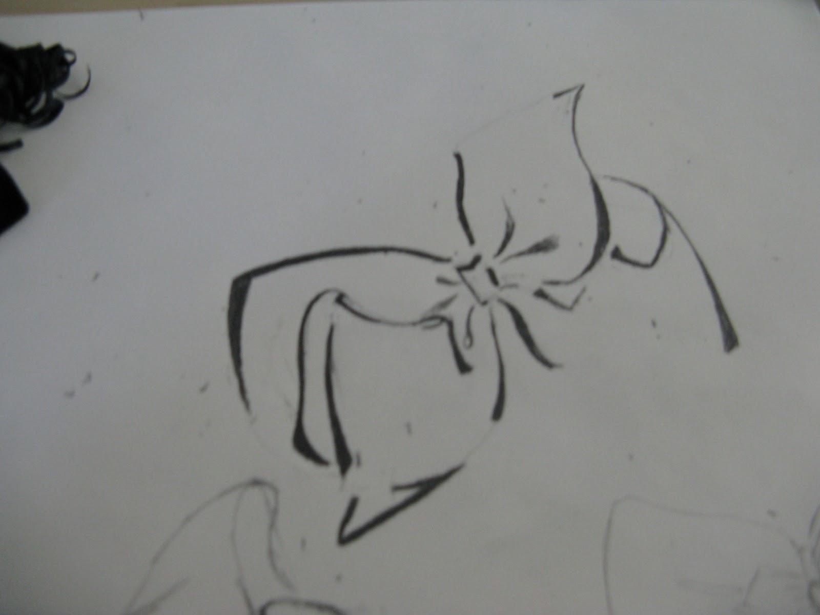
The idea behind it is a little girl, looking through a porthole into the world, but it's not the world that we see. Instead, it is the world in the child's eyes and how the child would present it. It also could be interpreted as a look into the child's imagination; since the chances of a child being in a submarine under the sea are very slim, it is implied that the situation is not real and what we see is a metaphor for the child's imagination. The child is drawn in a graphic style to show her youth, the wall and porthole are drawn in value to show their solidity separating the child and the imaginary world, and the imaginary world is drawn in messy crayon as the child might portray it in a drawing of her own. The bow is important in this setting because it shows that the girl looking through the porthole is a child.

Again, I have very little of this drawing in progress; I have one where it is mostly done.
You can see where I've tried again and again to draw and erase some semblance of shoulders to give the girl's head something to sit upon, but they just never seemed to belong. Each time I added shoulders it weighed the drawing down, making the outside of the porthole more realistic than I intended. I didn't want to include much of the girl's world because I wanted it to be up to the viewer which of the worlds they believed to be "real," and giving the girl a body tipped the scales just a little too far.

The finished product was cut out simply because it was awkwardly situated on the paper. I cut the drawing out irregularly to avoid marks I'd made with crayons and charcoal, but decided that it gave the girl's world the tiniest bit of instability, evening the score of the two worlds.

Finished:

This picture was done in 4B and B pencils, black vine charcoal, and various broken crayons I got at Goodwill.
Finally, the model bow:

Bow Project: Value Drawing

The second project in the series went through many idea changes. First I wanted to do a pile of bows in grosgrain, velvet, and satin. Then I wanted to do a big bow on a Christmas ornament. But at the risk of it being a "Christmas card" which would fall under the cliches we were supposed to avoid, I mounted the bow on a lantern. The bow gives the picture the holiday vibe without coming out and blatantly wishing the viewer a happy holidays.

I enjoy value the most out of all drawing techniques. It's fun to do (especially without a reference; just trying to guess where the light will shine!) and it almost always comes out looking beautiful.

Unfortunately I don't have any pictures of the lantern in progress, but it was a challenge to come up with a good design for the lantern itself. I hate hate hate using references, preferring to draw from my imagination, but on this I had a good amount of difficulty and finally looked at pictures of Victorian lighting and architecture for inspiration. Then I was able to take those ideas and settle on a good design for the lantern.

Once I was through with the drawing, though, I didn't like the white space. It gave the light a sense of pointlessness, and a lack of presence. It would be a hassle to color the entire background, and I felt like adding objects for it to shine on to show that light actually was emanating from it would take away from the lantern and bow as a whole. So I mounted the lantern on a piece of black paper and drew the light shining out from the lantern. The piece was done in 8B and 4B pencils, and white pastel.
As before, here is the model bow:

Bow Project: Line Drawing

For my Objects project I chose a bow, something very important and meaningful to me. Not only do they signify innocence and beauty, but I feel naked without one in my hair. For the line drawing, I made a simple, elegantly graphic drawing of a bow:
and cut out a stencil with an Exactoknife. I loved the way it looked already, but I wanted to reverse the colors (and Mrs. Parker wanted something with more effort). Originally I wanted to do the bow on a plain black skirt, but my attempt with sponging fabric paint came out entirely too gloppy.
So I just got some spray paint so the bow would have defined edges. The first few tries were not so good, but..

The one at the top turned out best. It has its imperfections, but I enjoy them; the paint spray gives it almost a shading effect. Mrs. Parker once told me to work with my mistakes, so I am, and I like the result.
It really does look nicer in real life...unfortunately it does not photograph very well.
Here is the lovely model! I used a different bow for each project...


This project was done on black paper with "Shock White" spray paint by Montana Cans.

Paper Bag Project

I went into this project absolutely dreading it. I'd done something similar in high school, and hated it. However, this was my first time using charcoal, truly using it (that line-drawing stuff doesn't count, bleh), and I had fun.

Before we began "drawing light," as Mrs. Parker would say, we had to outline everything using measuring and angling techniques we used on the skull and the pottery.

Before we could get started shading, we also had to "block in" areas of light, which basically means splattering areas of the outline with dark, middle, and light shades to refine later. This is something I did not enjoy doing at all; I refine as I go and this will not be a technique I use again. Of course I tried to do it my way anyhow, and got chewed out for it.
After the blocking-in was done I began refining, my favorite bit that I'd been itching to do from the beginning. Also, the fifth bag, which is seen a tiny bit in the above picture, just above and to the left of the leftmost bag, was allowed to be taken out, as it lacked cohesion once the picture was nearing completion. Not enough of the bag was seen from the angle I had taken to even give it any distinguishing features. At this point, outlines were beginning to blur into the forms of the bags themselves, so they appeared more 3D.

Something that I had trouble with up until the very end was getting the floor to lie flat behind the bags. There was very little floor to work with, and I had to inject some imaginary shadows in the upper left so it would appear to bear any semblance to flat ground. I really loved highlighting all the corners, and blending the shades together to erase any sign of handiwork, giving my piece a clean, smooth finish. Overall I'm very happy with the finished product. After all, that's what art does for me. Isn't it supposed to?

This piece was done on gray paper with charcoal in white, black, and 4 intermediate shades.

Overdue Social Justice Post

So a while back (October?) we were to create a piece on "social justice." I hate tackling serious topics unless they affect me personally, and nothing right now really is, so I did my project on something a little bit lighter: fashion and conformity. In our society, people who defy the conventional standard of dress are seen as "nonconformists" and "just trying to be different," and given labels such as "goth" or "slut." As a Lolita, I know I don't speak for everyone following a fashion subculture, but I do speak for much of the lolita community when I say: we're not "different." We're just like everyone in pretty much every way, shape, or form in terms of social conventions. We'd never stand out in a crowd otherwise. In fact, and I'm probably guilty of this as well, many of the people I've come across that have been labelled "different" because of how they dress are some of the most boring people personality-wise.

Since I'm not used to using a graphic style of drawing, I gave that a shot, using only solid lines with no shading. I chose to draw my characters in a cartoon style to keep the piece innocent; I didn't want it to seem like I was putting this issue at the same level as that of my classmates who did subjects such as domestic violence.

Originally I had drawn up three characters: A little Lolita girl, a shopkeeper advertising a pair of jeans, a young man pressuring the girl to straighten her curly hair, and a tan bombshell sitting on a tanning bed, looking at the pale lolita with disgust. These represent our current standards of physical beauty and presentation, all of which the lolita defies.
However, when I set the characters up to trap the lolita, I felt as if there were too many opportunities for her to escape the mob, so I added another character, an older gentleman presenting her with a book titled "How to Grow Up," in reference to her childlike attire.

On this setup, though, it was obvious the man had just been stuck in there at the last minute. So I cut out my templates...
and traced them over in the positions I wanted them for the final product.

Bits and pieces were colored for the final product, which turned out quite cute. In the final, there was less space at the bottom for the lolita to escape, which brings me to the last point: the only way out for her is through you, the viewer. Are you going to accept that she's a normal functional person like the rest of us? Or will you, too, push your standards of beauty on her before you can make yourself even begin to believe it?

This project was done entirely in black marker.

Monday, September 20, 2010

Just going through the motions, I suppose.

Here, have a picture dump. They are all of hands, but technically I can't tell you that, because naming the object sends our brain into our symbol bank and we stop seeing it. Oops.
I enjoyed the blind contours...continuous-line blind contour drawings are those in which we can't look at the drawing subject, nor can we lift our pencil from the paper. In a nutshell, fun yet frustrating.

I numbered many of them because I was running out of patience with the assignment, though.  Note the lines; we had to avoid an outline in favor of numerous contour lines.


I like this one. It looks like a crusty old zombie hand. This sort of thing is what is known as "expressive distortion."


Finding different positions with my hands was fun.


Another fun zombie hand.

Though I enjoyed the blind contours, the observed contours were terribly frustrating. My drawing technique relies heavily on shading instead of blatant lines, so those exercises got really old really fast. I hated not being able to erase my slip-ups. Obligatory definition time! An observed continuous line contour drawing is the same as the above, except we are allowed to look at the subject at hand (pun intended).


These were my first few, which were fun and vibrant. I had obviously not yet lost patience with the whole fiasco. Obviously the ones on the left are blind and the one on the right is observed.


One of the few observed drawings I actually like, and of course it doesn't photograph well...


...no comment.

This is me being INCREDIBLY fed up with this assignment. Note the grossly exaggerated middle finger. Also an example of VERY expressive distortion.

Aaaaand I draw in the lines anyway, since I can't erase, hahaha, so there, assignment...

Um, the end. I'm not used to blogging about things not fashion- or fanfiction-related...